
Marketing Apprentice on the Skills for Growth - SME Support programme.
How to Create High Converting Display Ads
In this article, we will walk you through some of the best ways to increase your display ad performance and create high converting ads. According to Google, display ads only have a click-through rate of 0.05%. This is of course very low, but with the following tips you’ll be able to create ads that far surpass this underwhelming average.
Use the “F-Pattern”
The F-pattern is widely regarded as the most accurate representation of eye-scanning patterns regarding blocks of content. The pattern was popularised by Nielsen Norman Group’s eye tracking study, which recorded more than 200 users looking at thousands of different web pages. They found that users’ viewing patterns were fairly consistent across various websites. The pattern looks somewhat like the letter “F”, hence the name, and consists of three components:
- Users tend to read horizontally across the top of the page
- They then scan vertically down the left side of the page
- Occasionally users stop to read from left to right, with the amount of time spent reading decreasing on the right side of the page as they move down

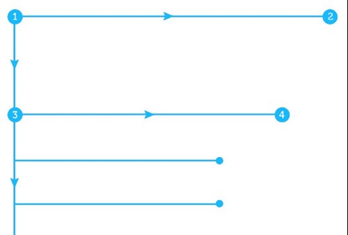

Looking at this pattern shows that users tend to pay the least attention to content on the far right side of the page, particularly towards the bottom of the page. It’s for this reason that ads at the top left of a page usually perform the best in terms of visibility. With this in mind, here are some steps you can take to give your ads the best chance of being seen:
- Left side is more visible than the right side
- Place ads higher up on the page
- Try placing ads in areas of the page where users will spend the most time looking at
Strike the Perfect Balance between Text and Image
Display ads with less text usually perform better than those stuffed with text, however there is a balance that needs to be struck when deciding how much text to include. You have to be able to capture users’ attention quickly, and a smaller amount of text will help you do that as they will have less to read. On the other hand, you don’t want users to be left feeling confused about what you’re promoting because you didn’t include enough text to describe it well enough. For example, here is an ad that suffers from a lack of text:

It is extremely difficult to make out what it is you’re looking at in this picture, but it is actually a flashlight that’s supposed to look like a pint of Guinness. Without having that knowledge before viewing this ad, many users would potentially have no idea what they’re looking at, and not understand what is being promoted. It fundamentally fails as an ad for these reasons.
On the other side of the spectrum, here is an ad that suffers due to excessive text:
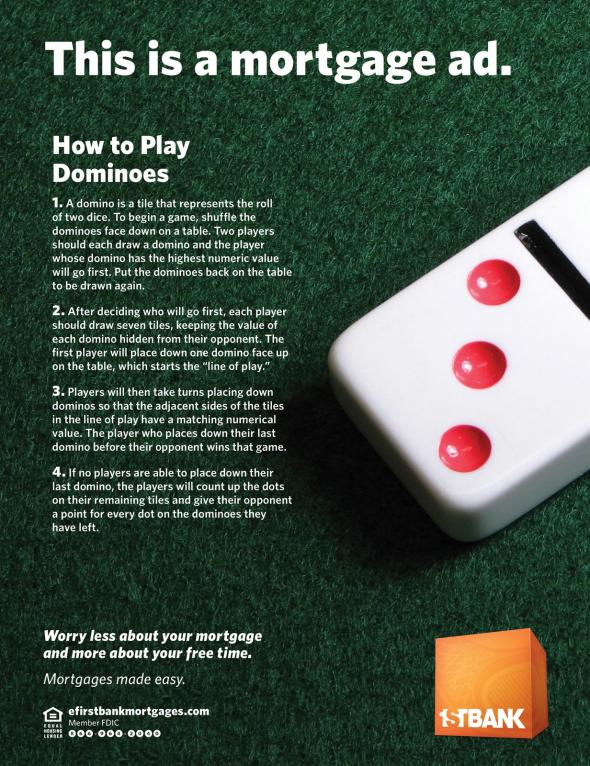

The abundance of body text alone is enough to prevent most people from giving their attention to it. Whilst the message of not worrying about your mortgage and having more free time is a strong one, it is let down by its poor visual layout.
Make your Ads Stand Out
To capture the user’s attention, your ad must stand out on a page and not fall victim to “banner blindness” – ignoring irrelevant ads, either consciously or unconsciously, that might disrupt a user’s website viewing experience. When designing your ad, try to balance making it visually impressive without it being disruptive to the user. One way of achieving this is to use bold eye-catching colours that differentiate the ad from the rest of your site. GIFs and Animations are also an effective way to capture the user’s attention. Data also shows that bigger is not always better in terms of your ad size. Medium rectangle (300x250px) banner ads tend to get the most impressions compared to other sizes.
Don’t Trick Users into Clicking on your Ad
The last thing you want to do is annoy users with your ads and give your brand a bad reputation. Making your ad so big it can’t be avoided, or making the X button to get rid of it so small it is hard to see, will only aggravate users and put them off your brand. Even if this method leads to higher click-through rates, the data will be useless as you won’t be able to tell who if people clicked on it intentionally or by accident. The best way to improve your ad performance is not by tricking users, but through creating ads that are relevant, useful, engaging and ensure a positive experience for the user.
Skills for Growth – SME Support can help you upskill your employees and examine your organisational structure to identify any skills gaps within your team. Click here to apply for our fully funded support service or call 0161 237 4444 and speak to a Skills Coach today.
About the author

Morgan Charnley